While making my website, I found 3 sites that I like. These pages inspire e to create my own.
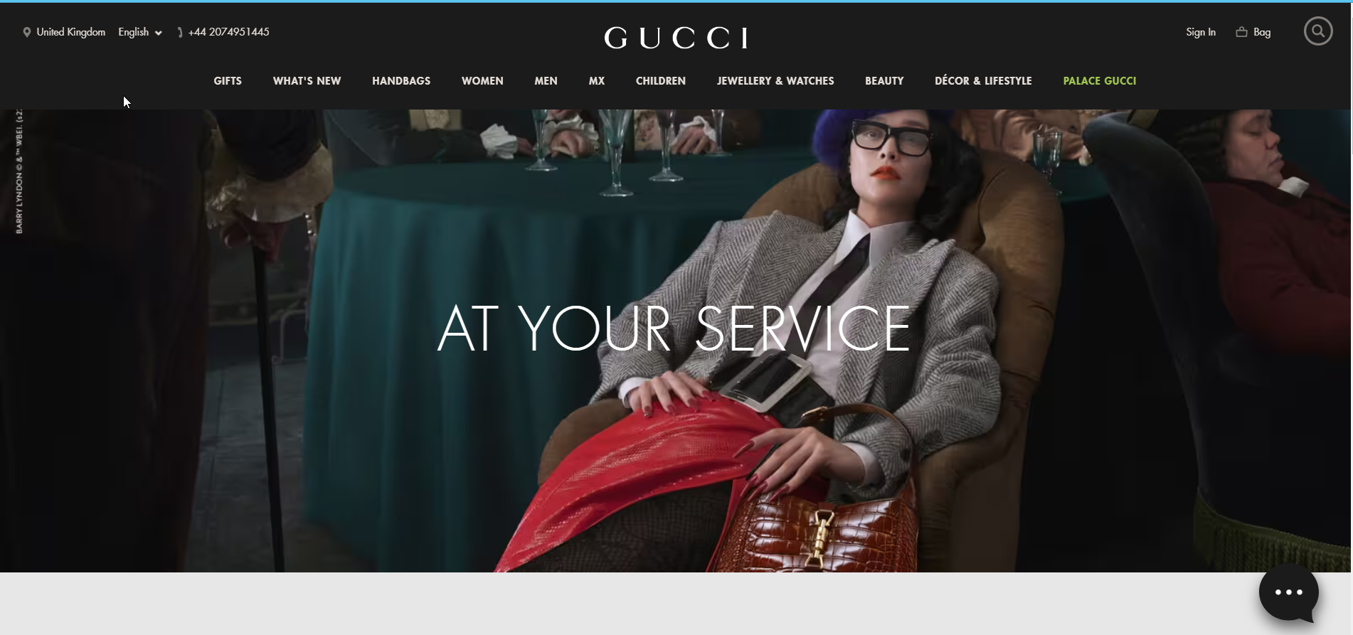
The first is Gucci.com. This is the website of a luxury clothing manufacturer. I like the simple design of the website. The navigation bar is easy to read. There are a lot of sub-categories. I prefer fewer categories on my website.However, everything is understandable. Additionally, when the cursor enters the navigation bar, it changes its color to black, which makes it easier to read. New products are shown on the main page. There are links to an online store where you can buy clothes. The photos are, in my opinion, very professionally made. Photographs made in vintage style. The photos are not too big and are perfectly placed on the website. However, I do not see information about the company's history. Probably the creators did not provide this information because it is a company with an established position and reputation. The website uses a sans-serif font which is very legible. I also use these fonts on my website. At the very bottom of the main page we have Stories, a kind of blog. What I like the most is that the website is simple and legible.
Another page I like is the website of the photographer I like and appreciate. I watch his videos on Youtube. I like his style. His name is Manny Ortiz. His website can be found at this address: manuelortizphoto.com. His internet site is very simple. His photo gallery is limited to the home page. There are two more categories of presets and tutorials. Which are the products he sells. Unfortunately, there is no information about him, which I don't like. Not everyone needs to know him, so it would be worth finding out something on his website. Once again, I like the simplicity of the website. However, in this case, I think there is not enough information. Not enough galleries for the photographer's website. On my website I want to have a more extensive gallery divided into categories of photos that I do. The footer at the bottom describes that the author will create a website with Squarespace, a website builder. It does not look professional to me. It should change that. I change it on my side.

Another page I like is Pedrontheworld. The main page makes an impression on me. I like the photos that cover the entire screen and the navigation menu in the middle. I like the slides on the main page. And also galleries similar to Instagram. The only thing I would change on this page are the fonts. I believe that the author of the website could choose better and more readable fonts. I think that the creator could change the logo to a more interesting and original. I like that the author of the website made a bookmark where he placed the clients he worked with. It is completely unsuccessful to combine information about the author wit a contact page. It is a big mess and I would separate it on my website.

You made a good start on this and it is great you have looked at the navigation, fonts and layout. However, this is incomplete. As mentioned in class, you needed to look at two websites, not three. You need to compare the two websites, by looking at not only the home page, but the about me page, contact me page and the gallery page.
ReplyDelete